


Understanding SHAP Plots
Unveiling the Black Box of Machine Learning Models


Imagine, Sarah, employed as a data analyst at a local bank, confused with understanding the intricacies of the bank's loan approval process. Her colleague Mark, a data scientist, observed her confusion and took it upon himself to assist her. Mark introduced Sarah to a colorful summary chart, clarifying, "This chart unveils how and why the bank's machine learning algorithm makes specific loan decisions. Each bar on the chart corresponds to a different factor, such as income, age, and job tenure. The taller the bar, the greater its influence."
Sarah nodded as Mark guided her through the chart. "For instance, a tall green bar representing income signifies its substantial role in loan approval, while a short purple bar for job tenure indicates its limited impact."
Excitedly, Sarah remarked, "So, these charts reveal the most influential factors!"
Mark smiled, saying, "Exactly! They simplify the process for better comprehension."
Leaving Mark's office, Sarah was eager to employ these charts in her work. Equipped with this invaluable tool, she felt confident in aiding the bank in making equitable loan decisions.
To put it simply, a SHAP plot serves as a summary visualization for complex machine learning models, such as Random Forest. It aids in understanding how each feature influences the target variable.

Benefits of Incorporating SHAP Plots:
Transparency: SHAP plots provide a transparent way to explain complex machine learning models, making their decision-making processes more understandable and interpretable.
Feature Importance: They quantify the importance of each feature, helping us identify which factors have the most significant impact on the model's predictions.
Local Interpretability: SHAP values offer local interpretability by explaining the prediction for a specific data point, making it easier to understand why a particular decision was made.
Model Debugging: SHAP plots assist in debugging models by pinpointing the key features responsible for unexpected or incorrect predictions, aiding in model improvement.
Fairness Analysis: They can be used to assess model fairness by examining how different features affect predictions for various demographic groups, helping to detect and mitigate bias in AI systems.
Step by Step Process:
import numpy as np
import pandas as pd
from sklearn.ensemble import RandomForestClassifier
from sklearn.model_selection import train_test_split
from sklearn.metrics import accuracy_score, classification_report
import shap
This code snippet is dedicated to importing a range of libraries essential for conducting mathematical operations, conducting comprehensive data analysis, and facilitating the development of machine learning models. Notably, the inclusion of the 'shap' library holds particular significance, as it houses the functions necessary for the generation of SHAP values and SHAP plots, enhancing our capability for model interpretability.
folder_path ="/dbfs/mnt/archive/blog/"
data= pd.read_csv(folder_path + 'WA_Fn-UseC_-Telco-Customer-Churn.csv')
In this project, we leverage Databricks File System (DBFS) for efficient data management on the Databricks platform, utilizing the 'mnt' directory as a convenient access point for external storage sources. We retrieve the file 'WA_Fn-UseC_-Telco-Customer-Churn.csv' from the designated path "/dbfs/mnt/archive/blog/" located in our Azure data lake. This file is then loaded into a Pandas DataFrame, 'data'. The dataset is related to customer churn in a telecommunications company, offering valuable insights into customer retention factors (dataset reference are available in the sections below).
df = data.copy()
categorical_cols = df.select_dtypes(include=['object']).columns
binary_cat = []
other_cat =[]
for col in categorical_cols:
    categories = df[col].unique()
    categories = df[col].unique()
    #print(f"Unique categories in '{col}': {categories}")
    if len(categories)==2:
        binary_cat.append(col)
    else:
        other_cat.append(col)
print("Binary categorical columns:", binary_cat)
print("Other categorical columns >2:", other_cat)
# replacing the binary category in each columns
df['gender'] = df['gender'].replace({'Female': 0, 'Male': 1})
df['Partner'] = df['Partner'].replace({'Yes':1, 'No':0})
df['Dependents'] = df['Dependents'].replace({'Yes':1, 'No':0})
df['PhoneService'] = df['PhoneService'].replace({'Yes':1, 'No':0})
df['PaperlessBilling'] = df['PaperlessBilling'].replace({'Yes':1, 'No':0})
df['Churn'] = df['Churn'].replace({'Yes':1, 'No':0})
# One hot encoding for other categories
df_encoded = pd.get_dummies(df, columns=other_cat)
This code segment meticulously identifies categorical (non-numerical) columns within the DataFrame ‘df’. The primary objective is to distinguish between binary and non-binary categories. For binary categorical columns, values are systematically transformed to 0 and 1. In the case of non-binary categories (containing more than two unique values), one-hot encoding is employed, effectively converting these categorical data into a numerical format, thus facilitating further data processing and analysis.
X = df_encoded[input_features]
y = df_encoded[target]
X_train, X_test, y_train, y_test = train_test_split(X, y, test_size=0.2, random_state=42)
This code segment specifies the input feature names and the target variable. We then use the train_test_split function to divide our data into training and testing sets, with 80% used for training and 20% reserved for testing.
rf_classifier = RandomForestClassifier(n_estimators=100, random_state=42)
rf_classifier.fit(X_train, y_train)
y_pred = rf_classifier.predict(X_test)
classification_rep = classification_report(y_test, y_pred)
print('Classification Report:\n', classification_rep)
feature_importances = rf_classifier.feature_importances_
In this part of the analysis, we employ a RandomForestClassifier, a robust machine learning model known for its accuracy and efficiency in handling complex datasets. The model is initialized with 100 trees (n_estimators=100) and a fixed random_state of 42 for reproducibility of results. We then train the model (fit) using our training dataset (X_train and y_train). After training, the model is used to make predictions (predict) on the test dataset (X_test), producing y_pred, which are the model's predictions that we can compare against actual outcomes for evaluation. We then generate classification reports and feature importance for understanding model accuracy.
SHAP values and Plot
explainer = shap.TreeExplainer(rf_classifier)In this line of code, we are setting up an 'explainer' to help us understand how our machine learning model (rf_classifier), makes its predictions.
shap_values = explainer.shap_values(X_test)This segment of code calculates the SHAP values, which tell us how much each feature contributes to a specific prediction. X_test is the dataset used to generate these shap values.
shap.summary_plot(shap_values[1], X_test)This code creates a summary plot using SHAP, providing a visual overview of how different features influence a single prediction made by the model. It helps us see which factors are driving the model's decision for that particular instance (for each row). See the resulted SHAP plot and its explanation below:
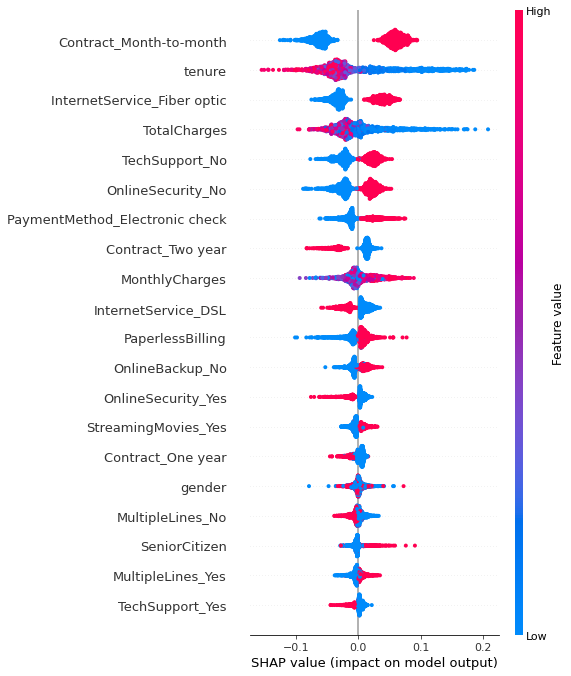
Feature Importance: Each row on the chart represents a feature from the dataset. The features are sorted by the sum of SHAP value magnitudes over all samples or instances, with the most important feature at the top. In this plot, 'Contract_Month-to-month', 'tenure', and 'InternetService_Fiber optic' are the top three features, indicating they have the most substantial impact on the model's predictions.
SHAP Values: The plot shows individual SHAP values for each feature for many samples. A SHAP value can be positive or negative and represents the impact of the feature on the prediction relative to a baseline prediction. In this plot, red points indicate higher feature values, while blue points indicate lower feature values.
Density of Points: The color density of the points (red or blue) can indicate the number of samples with similar SHAP values. For instance, a thick cluster of red points indicates many samples with high feature values and similar positive impact on predictions.
Vertical Dispersion: The vertical dispersion of points represents interaction effects. If points for a single feature are spread vertically, it suggests that the impact of that feature on the model's output varies depending on the interaction with other features.
References:
Dataset: For this project, we used the customer churn data for a telecom company, which is publicly available on Kaggle. The code is available here.