
Unlocking Insights: Understand Your Dataset with Multilayered Visuals using Sunburst Plots


Imagine Lisa has a clothing store. Amidst the array of sales data for clothing deals, Lisa found herself lost in a maze of numbers. She yearned for a clearer picture of which items drove the highest revenues across deal size categories. With traditional charts, the data seemed overwhelming, lacking a cohesive story. Then, she stumbled upon a novel way to visualize the data. Using a dynamic tool, Lisa could explore the sales data in layers, starting with broad categories like small, medium and large, and drilling down to specifics like number of units sold and unit price for each order. This layered approach illuminated trends she hadn't noticed before, revealing the most lucrative deals in each segment. With this newfound clarity, Lisa could tailor her inventory and marketing strategies more effectively, ensuring her store thrived in every corner of the market.
The sunburst is similar to the dynamic tool Lisa used. The Plotly library’s sunburst plot has tremendous capabilities to visualize multilayered information in the most exploratory way.
The significance and benefits of sunburst plot are (not limited) :
Hierarchical Representation: One of the key benefits of sunburst plots is their ability to visually represent hierarchical data structures. This allows users to explore data at different levels of granularity, from broad categories to specific details, in a single intuitive visualization. By presenting data hierarchically, sunburst plots enable users to grasp complex relationships and spot patterns more easily than traditional charts or tables.
Insightful Analysis: Sunburst plots facilitate insightful analysis by visually highlighting relationships, trends, and outliers within datasets. The circular layout and color-coded segments make it easy to identify key factors contributing to overall patterns. Users can quickly discern which segments are the most significant contributors to a given outcome, helping them make informed decisions and take targeted actions based on their findings.
Interactive Exploration: Sunburst plots offer interactive exploration capabilities, allowing users to drill down into specific segments or zoom out to view the broader context of the data. This interactivity empowers users to explore data from multiple perspectives, uncovering hidden insights and gaining a deeper understanding of complex datasets. By enabling users to interactively manipulate and navigate the visualization, sunburst plots promote a more dynamic and engaging data analysis experience.
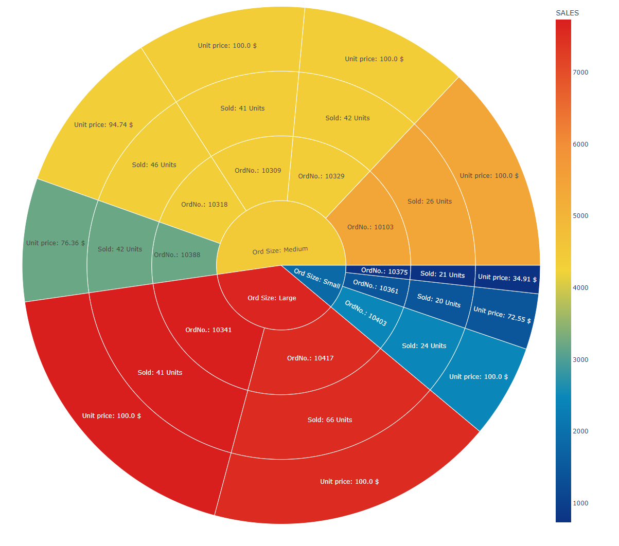
Sunburst plot
The sunburst plot depicted below illustrates the multilayered sales data across three distinct order size categories. As evidenced, the plot provides a clear understanding of both the high-level and granular information within each category. The colors assigned to each section in the sunburst plot signify the total sales associated with orders within a specific category.
Code
import plotly as px
fig = px.sunburst(df.head(10),path=['deal size', 'ordernumber', 'orderedquantity', 'price each'], values='SALES', color='SALES', height=1600, width=1600, color_continuous_scale='Portland', labels= 'SALES', hover_data=['SALES'], title = 'Multilayered sales information for each order')
display(fig)
Reference
For this, we utilized the sales data from Kaggle. The code can be found here.